Like many social networks, things on Twitter are changing. They have started rolling out a new design to their pages on Tuesday to a small portion of their users. The new design so far has been activated mostly for celebrities or new users, but it’s coming to everyone soon.
The tweaks come mostly to Twitter’s desktop profiles. The new web profile use a larger photo, customizable header photo, best tweets and more. Here’s everything you need to know:
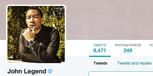
Profile image: Now your profile image is much large than before and also in a different spot on the profile. Currently Twitter isn’t offering guidance on image size and shape, we are sure that will be coming.
Current photo size: Current photo preview:
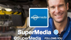

New photo size: New photo preview:
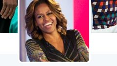
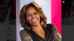
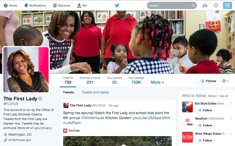
Photo header: Now the header is not the same as a background for your page or theme. Twitter however does still offer a collection of themes with the ability to upload your own, but the backgrounds for the old profiles may not work with this new design. To add a profile header image, just click on the space at the top of your page in the edit screen and upload a photo (specs noted 1,500 pixels wide, max). You still will have the ability to scale and move the image around to fit properly.
Examples:
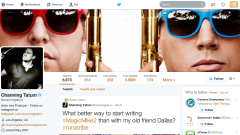
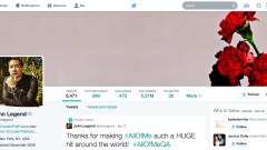
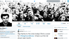
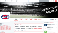
Information and details: Twitter names, @handles, descriptions, links and the profile picture are not on the far left of the screen anymore. They stand out better centered under the header image. In the old page layout, the menu of tweets, following, followers, favorites and lists were all below.
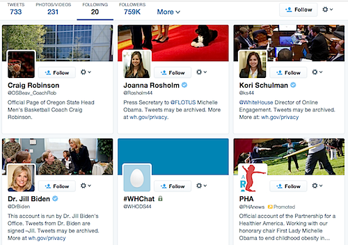
Following: Twitter’s “following” list has changed quite a bit. Instead of an actual list like before, you’ll now see a board of cards for everyone you’re following. This allows Twitter to add more detail to each account including profile pic, header image, description, follow link and other actions.
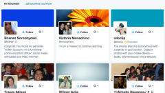
Photos and videos and followers:
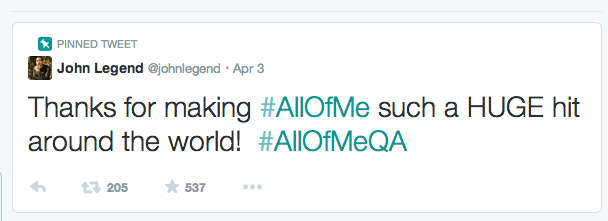
Pinned Tweet: Now you can pin one of your Tweets to the top of your page, so it’s easy for you to display a message to your followers that you want them to see first. You can do this by clicking on the “more” part in every tweet (the three dots), and select “pin to your profile page”.
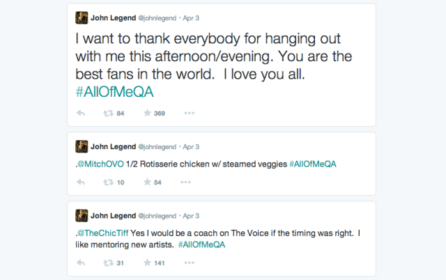
Best Tweets: This is very interesting. Tweets that have received more engagement than other Tweets will appear slightly larger and bolder, so your followers can see your best content quicker and faster.
Notice the first Tweet:
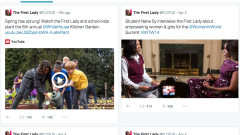
Filtered tweets: This feature allows you to choose which timeline to view when checking out other others profiles. You can select from these options: Tweets, Tweets with photos/videos or Tweets and replies.
The big picture:
Overall, Twitter’s new profiles actually are better-looking than before, but the large images and large fonts can be a little overwhelming. Only time will tell if Twitter’s new design attracts more users or turns them off. What do you think of the new design?


